Typography / Task 1: Exercises
29/08/2022 - 26/09/2022 / Week 1 - Week 5
Kim Min Ah / 0356145
Typography / Creative Media / Taylor's Design School
EXERCISES
Task 1: Exercise 1 (Type Expression)
Task 1: Exercise 2 (Type Animation)
Task 1: Exercise 3 (Type Formatting)
PHYSICAL CLASS
Week 1 (29/08/2022)
For the week 1 class, we had a brief introduction to typography class. We also learned how to set up an e-portfolio platform which is "blogger".
Week 2 (05/09/2022)
The class of week 2 started off with receiving feedback on our design sketches for the first exercise from Mr.Vinod. After that, we were taught how to create outlines, ungroup and distort each letter on adobe illustrator which is the required skill for the upcoming task.
Week 4 (19/09/2022)
In physical class on week 5, we had feedback on our Type formatting exercise and were informed about the upcoming task.
LECTURES
Pre-recorded Lecture ( Development)
In the first pre-recorded lecture video, Mr. Vinod explained the history
and progress of the development of typefaces.
Early letterform development: Phoenician to Roman

Typefaces have always been growing with humans and civilization for over 500 years.

The initial writing was started by scratching into wet clay with sticks or inscribing on stones.
The letters are in a composition of straight lines and some circles due to the manner of early writing.

Letters were not only about how to be formed. The Greeks developed a style of writing ‘boustrophedon’, meaning that the text lines change from left to right and right to left. In addition, they also changed the orientation of the letterforms which was supposed to increase readability.

Before carving on marble, Etruscans painted letterforms first. Details like the different sizes of strokes were completed by controlling the weight from vertical to horizontal.

Through the period of development over Phoenician and Greek, the letterform ’Roman’ which is commonly used till modern days was completed.

The Written square Capital letterforms can be found in Roman monuments. Serifs were applied to the main strokes of the letters.

The compressed version of Square Capital Letters, also known as rustic capitals allows for having more letters on a piece of sheet compared to the previous Square Capital Letters. However, it’s slightly difficult to read due to its compressed form.

Figure 1.1.8 4th century - Roman Cursive (image from Mr.Vinod's lecture)
Both Square Capitals and Rustic Capitals were used for documents. For the convenience of informal use such as daily transactions, cursive handwriting was regularly used.

The typeface Uncials adopted some features of Roman cursive handwriting. As "Uncial" means ‘twelfth’ in Latin, some scholars postulate that Uncials refer to letters that are one inch (one-twelfth of food) high.

The cursive handwriting was developed into a formalized typeface, the "Half-Uncials".
This letterform became the origin of the Phoenician alphabet.

Charlemagne, the first unifier of Europe nominated Caroline minuscule as a standard letterform for all ecclesiastical use. The rewritten version of Caroline including capitalization, punctuation, etc became a standard of calligraphy for a century.


In northern Europe, a letterform has strong virtual condenses such as 'Blackletter' or 'Textura' was popular.
On the other hand, a rounder type of letterform called 'Rotunda' gained more popularity in southern Europe.
1450 Blackletter
As the earliest printing typeface, it was created based on northern hand-copying styles that were often used for books. e.g.) Cloister Black, Goudy Text

1475 Old style
The lowercase form of this typeface is based on Italian humanist scholars' book copying handwriting. The uppercase form was found inscribed on Roman monuments.
e.g.) Bembo, Casion, Garamond...

1500 Italic
The early italic forms were condensed and close-set, making it possible to have more words per page. Since the sixteenth century, all typefaces have been designed in italic forms.

1550 Script
Script letterform is not proper for a large amount of text. On the other hand, it has been used widely for shorter writing settings. e.g.) Mistral, Snell Roundhand, Kuenstler

1750 Transitional
The transitional form is a refined version of Oldstyle forms. It advanced the casting and printing system. e.g.) Baskerville, Time Roman, Bulmer
https://thefontsmagazine.com/font/baskerville-font/
1775 Modern
This style represents the rationalization of Oldstyle letterforms. It has serifs without brackets and also has extreme contrast of thickness on strokes. e.g.)Bell, Caledonia, Didot

https://en.wikipedia.org/wiki/Didot_%28typeface%29#/media/File:DidotSP.svg
1825 Square Serif / Slab Serif
This letterform has heavily bracketed serif and barely has contrast on the thickness of strokes.
Mostly used for advertisement or commercial printing. It's evolved to an unbracketed letterform.
e.g.) Clarendon, Serifa, Rockwell

1900 Sans Serif
As the name, Sans serif is a letterform that doesn't have serifs. Even though it was opened to the public by Willian Caslon IV in 1816, it wasn't used widely until the twentieth century.
e.g.) Grotesk, Gill Sans Optima...

https://en.wikipedia.org/wiki/Optima#/media/File:Optima_font_sample.svg
1990 Serif / Sans Serif
This letterform was developed recently. By including both Serif and Sans serif letters, this typeface has enlarged the concept of a typeface family. e.g.) Rotis, Scala, Stone

Pre-recorded Lecture (Basic)
In the week 2 lecture video (Basic), Mr'Vinod explained the basic structure of letterforms which is also called 'Typography Anatomy'.

Figure 1.3.4 Structure of letterform, (image from Mr.Vinod's lecture)

Figure 1.3.5 Type Anatomy Research, Pinterest
Baseline - The imaginary baseline of letterforms.
Median - The imaginary line that defines the height of the letterform 'x'.
X-height - The height of the lower case letterform 'x'.
Stroke - The lines define the basic letterform.
Apex / Vertex - The crossing points created by two stems cross diagonally.
Arm - The short strokes(either horizontal such as E, F, L or inclined upward such as K, Y) from the stems of the letterform.
Ascender - The part of the stems of lower case form which is located right above the median.
Barb - The half-serifs on some curved strokes. e.g.) C, G, S
Beak - The half-serifs on some horizontal arms. e.g.) E, T, L
Bowl - The rounded which is usually described as a counter.
Bracket - The transitioning part between the serif and the stem.
Cross Bar - The horizontal strokes that connect two stems together. e.g.) AN H
Cross Stroke - The horizontal strokes that connect two stems together. e.g.) f, t
Crotch - The interior space where two strokes meet. e.g.) K, V
Descender - The part of the stems of lowercase letterform that is located below the baseline. e.g.) p, q, y
Ear - The strokes extending out from the main stem or body of the letterform. e.g.) g, r
Em/en - Em/en indicates the horizontal width of upper case 'M'. It's equal to the distance of two letters in the same typeface as the letter 'M'. En is the half size of an Em. Most often used to describe Em/en spaces and Em/en dashes.
Finial - The rounded non-serif terminals on strokes.
Leg - The short strokes from the stem of the letterforms. Either at the bottom of the stroke e.g. ) L or slanted downward. e.g.) K, R
Ligature - The parts between letters formed by the combination of two or more letterforms. e.g.) fl, fi
Link - The stroke that connects the bowl and the loop of lowercase 'g'.
Serif - The right-angled or oblique foot at the end of the stroke. e.g.) A T, M
Shoulder - The curved strokes that are not part of bowls.
Spine - The curved stem of the S.
Spur - The extended articulates of the curved and rectilinear stroke.
Stress - The direction of the letterforms.
Swash - The flourish part extended from the stroke of the letterform.
Terminal - The self-contained stroke without a serif.
Small Capitals
Uppercase letterforms that are in the size of the x-height of the typeface.
They are usually available in serif fonts as an expert set. Most Small capitals are generated based on uppercase letterforms.
Pre-recorded Lecture (Typo_3_Text_P1 )
increase the size of the font - command + shift + p
turn off the margin and column - command + semicolon key
kern(reduce) - option + left arrow / kern(increase) - option + right arrow
Kerning/ increment - 5 is proper
Kerning

Refers to automatic adjustment of space between letters.
It is often misunderstood as “letter-spacing”. Letter spacing is adding spaces between letters.

When you use uppercase letters for title or etc, It is better to kern a bit for better presentability.
(Do not letterspace uppercases, but kern them)

In paragraph loose tracking or tight tracking doesn’t really work. It decreases readability.
Flush left
Make sure to smooth the rags on the right side
Centre alignment
It should be used for a small number of letters. eg) invitation card
It doesn’t give a good reading experience to viewers
Flush right
Suitable for the caption of images
Justified
It would not be the best choice for every case.
Depends on the context and also depends on kerning.
Rivers - gaps between letters
Must avoid having rivers as much as possible
If u notice the typeface before the letter,
Have to change the typeface
The type size should be large enough to provide good readability.
DO NOT USE SCRIPT TYPEFACES IN CAPITAL LETTERS
Pre-recorded Lecture (Typo_4 Text_Part 2)
Pilcrow can be used to indicates paragraph spacing without breaking the line spacing.
Line space is supposed to 1pt - 3pt bigger than font size. (Depends on the x-height of a font)
For line spacing, the font is 10pt, the line space is 12pt and the paragraph space has to be 12 pt as well to maintain cross alignments. Leading should be not more than three times or less than three times.
Widows and Orphans

A widow is a short line of type left alone at the end of a column of text.
An orphan is a short line of type left alone at the start of new column.
Avoid to have widows or orphans.
Highlighting text
Using Italics, increasing the boldness of the font, changing the typeface and the boldness, and changing the font’s colours. But only into black, cyan and magenta. Also can create a grey box to highlight.
Resizing font size

Because the ascender of the serif typefaces is slightly taller, when a typeface is changed from sans-serif to serif, it is better to reduce its size by about 0.5 pt.


Primes are not quotation
Primes are abbreviations for inches and feet.
A,B,C headline example

Pre-recorded Lecture (Typo_5_Understanding)


One of the most rewarding ways to understand a letterform is to examine them in close detail.
The basic principles of Graphic Design apply directly to typography.
Pre-recorded Lecture (Typo_Ex Type Expression Animation — Basic)
Through the lecture, Mr.Vinod explained how to create a short GIF form animation on illustrator and photoshop.


Figure 1.4.8 screenshot of progress in adobe photoshop
After creating individual frames, click on the file panel, go to 'scripts' and click on 'Load Files into Stack'.

Figure 1.4.9 screenshot of progress in adobe photoshop

After adding frames in the right order in photoshop, export the file for "web" as a GIF file.
Pre-recorded Lecture (Typo_Ex Text Formatting 1:4 )
Kerning
Kerning is adjusting spaces between individual letterforms.
Kern - select the area and option + left arrow to reduce the space
If the gap reduces too big, go to preference, and change units and increments to 5.
Tracking
Tracking is adjusting spaces uniformly over the range of the characters.
Tracking - select all characters - option + right arrow to increase (left arrow to decrease)
Pre-recorded Lecture (Typo_Ex Text Formatting 2:4 )
Good page layout heavily depends on the margin.
4 columns are too much for A4
55 - 65 characters in one line
For hand-holding documents, font sizes 8 to 12 are suitable.
12.2 points or more leading on A4 size, but depends on the typeface.
Paragraph formatting control(paragraph space)
Below line indent 12 pt must have pt
Pre-recorded Lecture (Typo_Ex Text Formatting 3:4 )
Reduce the rags by tracking and kerning
Do not make it too obvious (1~3)
Turn off hyphens
W - preview
When use full justified column gutter has to be increased bit more to keep enough space between paragraph and the lines of the column.
Pre-recorded Lecture (Typo_Ex Text Formatting 4:4 )
Apply double leading on heading.
To use baseline grid,
View - guides- show baseline grid
To see baseline grid from far away view,
preferences - grids - view threshold : 50%
To adjust the paragraphs on baseline,
Text frame options - baseline option - offset : leading
General - line to top
Pre-recorded Lecture (Typo_Ex Text Formatting 4:4A)
When u increase the leading of heading, it has to be double amount of the paragraph leading setting.
Quick way to adjust paragraph to baseline
Select all - paragraph control - align to baseline
INSTRUCTIONS
Task 1: Exercise 1 - Type Expression
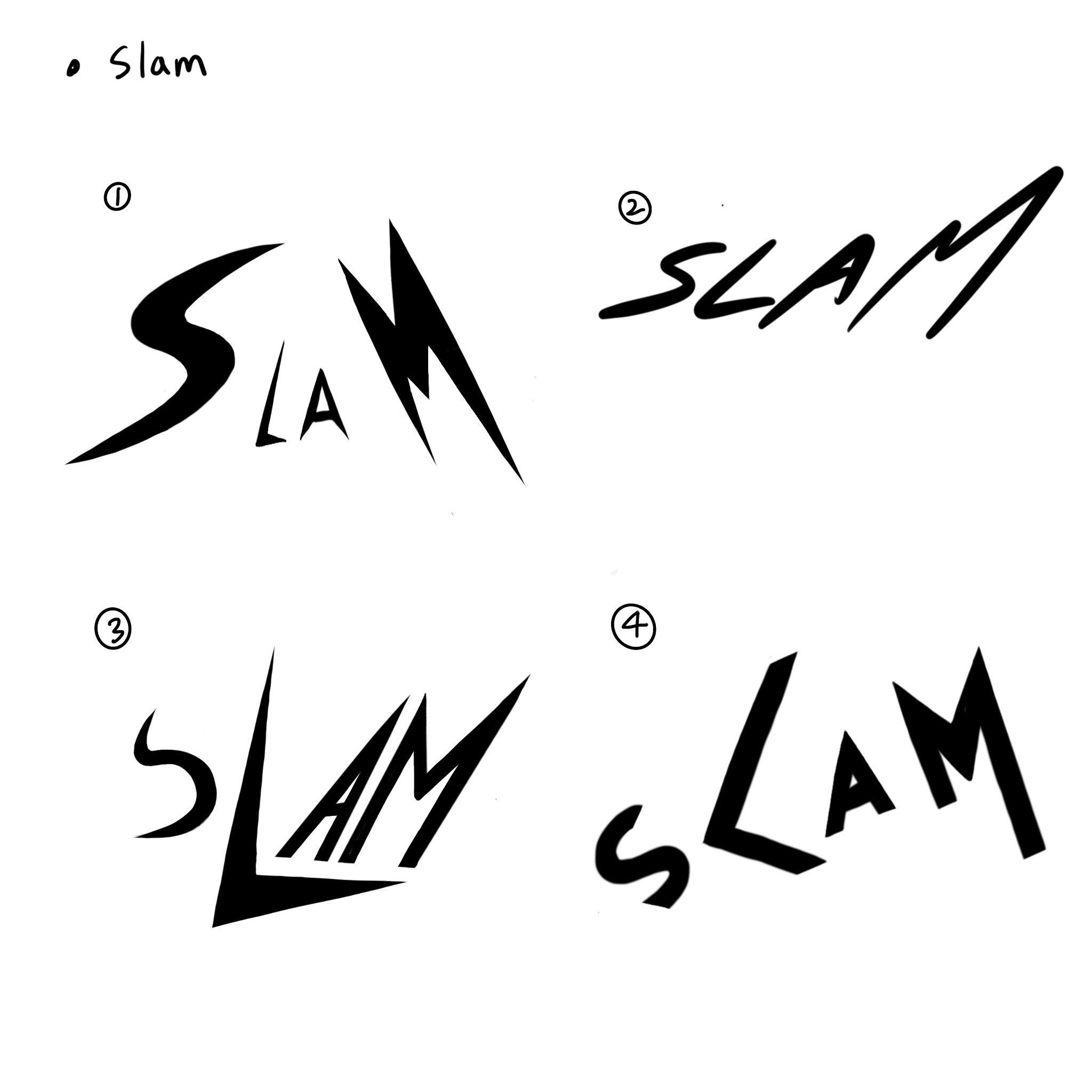
Progress (rough sketches)


Updated (rough sketches)

Figure 1.5.7 Slam Sketch (based on feedback) (05/09/2022)
Task 1: Exercise 1 - Type Expression (Digitalization)
Progress
Freeze

Figure 1.5.8 'Freeze' digital version (05/09/2022)
The typeface, Gill Sans Bold was used for all letters. The letters were distorted by using the direct selection tool after creating outlines. The terminals and strokes were recreated into a sharp shape in terms of giving a keen impression of icicles. Little triangle-shaped illustrations were added on at the end of the terminal to imply being frozen.

Tired

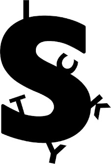
Slam

Sticky


Updated


Final submission of Task 1: Exercise 1 - Type Expression
Figure 1.6.7 text expression, exercise 1 final (05/09/2022)
Task 1: Exercise 2 - Animation
Progress
Tired


Sticky


Final submission of Task 1: Exercise 2 - Type Animation
Figure 1.7.3 sticky, final work for animation
Based on the feedback I had, a longer hold was adopted on the last frame.
Task 1: Exercise 3 - Type Formatting
Progress


Figure 1.7.5 layout 1 with grids and baselines, (23/09/2022)

Figure 1.7.6 layout 1 without grids and baselines, (23/09/2022)
Body
- Font/s: Gill Sans Regular
- Type Size/s:9 pt
- Leading:12pt
- Paragraph spacing:12pt
- Characters per-line:65
- Alignment: left justified
- Margins: 0.5in
- Columns: 2
- Gutter: 0.375in
- Font/s: Adobe Caslon Bold
- Type Size/s:24 pt
- Leading:24pt
- Alignment: left align

Figure 1.7.7 layout 2 with grids and baselines, (23/09/2022)

- Font/s: Gill Sans Regular
- Type Size/s:9 pt
- Leading:12pt
- Paragraph spacing:12pt
- Characters per-line:65
- Alignment: left justified
- Margins: 0.5in
- Columns: 2
- Gutter: 0.375in
- Font/s: Adobe Caslon Bold
- Type Size/s:24 pt
- Leading:24pt
- Alignment: left align
Final submission of Task 1: Exercise 3 - Type Formatting


Figure 1.8.1 final submission without baseline grids (JPG) (26/09/2022)

Figure 1.8.1 final submission without baseline grids (JPG) (26/09/2022)
Figure 1.8.3 final submission without baseline grids (PDF) (26/09/2022)
FEEDBACK
Week 2 (05/09/2022)


Week 3 (12/09/2022)
The feedback I received for all design works except the digital version of Slam was that I have to avoid using excessive distortion on the letterforms.


The feedback I received for all design works except the Slam was that I have to avoid using excessive distortion on the letterforms.

Freeze - need to avoid using excessive distortion on the letterforms.
Tired - need to avoid using excessive distortion on the letterforms.
Slam - The digitalized version of Slam is acceptable.
Sticky - need to avoid using excessive distortion on the letterforms.
The distinct of each typeface has to be recognizable.
Distortion is not the right solution for every work!
Week 4 (19/09/2022)
Week 5 (26/09/2022)
I had feedback on having too much leading which causes low legibility, leading should not be more than 3pt. Also, the overall layout doesn't have enough space.
FURTHER READING

Week 1 (introduction)

Figure 1.9.6 screenshot of introduction, A type primer by John Kane
This book is a practical guidebook for students who just started learning graphic design. This book started with an introduction about what is graphic design, and why typography is important to have a good design.
Graphic design is for problem-solving.
And working successfully with type is one of the most essential elements for effective design.
Characters and good legibility of letters(type) only exist in the context of voids. The change of one character’s space immediately affects its relationship with all other spaces with other letters.
Week 2 (page 2 - 4)

Week 3 (page 5 - 7)

Figure 1.9.8 screenshot of page 5, The font, A type primer by John Kane

Figure 1.9.9 screenshot of page 6, The font, A type primer by John Kane
The full font of the typeface provides more than 26 letters, 10 numerals, and a few punctuation marks. In terms of working successfully, it is important to work with a full font set and know how to use it.
A full font set includes uppercase, lowercase, small capitals, uppercase numerals, lowercase numerals, italic, punctuation, miscellaneous characters and dingbats.
Small capitals are in uppercase letterforms but are drawn to the x-height of the typefaces. Small caps are found in serif fonts.
There are two kinds of numerals in a full font set, uppercase numerals and lowercase numerals. Uppercase numerals are the same height as uppercase letters and are generally used for tabular material or with uppercase letter settings. Lowercase numerals are set to x-height with ascenders and descenders. They are used with both uppercase and lowercase settings.
Lowercase numerals are not that common in sans serif typefaces.
All fonts contain standard punctuation marks, but miscellaneous characters could be different depending on typefaces. It is important to be acquainted if all characters are available in a typeface before starting to work with it.
Week 4 (page 8 - 9)

Combinations of these styles could be found within one type family.
Roman, Italic, Boldface, Light, Condensed and Extended
Roman is the basic letterform style. Its uppercase forms are derived from inscriptions from Roman monuments. Italic style is derived from 15th-century Italian handwriting. Boldface can also be called ‘Semibold’, ‘Medium’, ‘Black’, ‘Extra bold’, or ‘super’ depending on the width of strokes.
Week 5 (page 10)

Figure 2.1.2 screenshot of page 10, Measuring type, A type primer by John

Figure 2.1.3 screenshot of page 10 - 2, Measuring Type, A type primer by John
Typography has its own units of measurement.
Measuring the size of a font covers from the top of the ascender to the bottom of the descender of a letter. “Points” are used to calculate the size of a type which is 1/72 of an inch or .35mm. Six picas to an inch.
Experience
Even though I’ve studied typography before, I’ve not always been sure about my typography skills. Also, I’ve always felt that there are some missing parts of my own understanding of the concept of typography and finding effective typeface styles and layouts. However, I was able to fulfill those blanks through this typography class. The lectures and assignments were extremely interesting and practical.
Observation I observed that I’m the type of person who has to make little notes for every important piece of information in class. It’s not only to prevent myself from forgetting them, I see myself understanding information way better when it’s written. I also observed that I need some improvement in the sense of alignment for effective layouts.
Findings
I found that prerecorded lectures for students' reference were very helpful to me in terms of providing the historical background of typefaces, the essential skills and the concept of typography.
I also realized that typefaces do way more than just being used and have greater power than I’ve ever expected. I learned that we can see the cultures and social atmosphere of an era through a typeface. All typefaces go along with their histories.
Also, receiving feedback about my work at the beginning of classes had me learn how to see my work from different perspectives and in a bigger picture.


Comments
Post a Comment