Typography / Task 2: Typographic Exploration & Communication
03/10/2022 - 10/10/2022 / Week 6 - Week 7
Kim Min Ah / 0356145
Typography / Creative Media / Taylor's Design School
EXERCISE
Task 2: Typographic Exploration & Communication (Text formatting and Expression)
PHYSICAL CLASS
Week 6 (03/10/2022)
During the class, Students got to have chances to give each other feedback on Task 2 progress. Also, we had feedback on our work progress and e-portfolio from Mr.Vinod.
Week 7 (10/10/2022)
Public Holiday
LECTURES
Typo_5_Understanding
In the past, typography was only considered “typography” when it was on paper.
In modern days, typography exists not only on paper but on a multitude of screens.
Good typefaces for print (elegant and intellectual, high readability even in the small font set)
- Caslon
- Garamond
- Baskerville
Good typefaces for screen
- Open sans
- aLto
- Arial
- Helvetica
- Times New Roman,
- Times
- Courier New
- Courier
- Verdana
- Georgia
- Palatino
- Garamond
Typefaces for screens are optimized and modified to improve readability in a variety of screen environments. It includes taller x-heights or reduced ascenders and descenders, wider letterforms, more open counters…, etc
Typefaces intended for smaller sizes have more open spacing for better readability and character recognition.
The font size on screen
Reading at arm’s length: at least 12 points which are about the same size as 16 pixels on most screens
16-pixel text on a screen is about the same size as the printed text in a book
Different devices have different pixel settings as well.
Static vs motion
INSTRUCTION
Figure 1.1.2 Typography Task Instruction
Task 2: Typographic Exploration & Communication
Progress
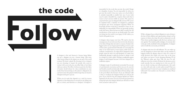
- Font/s: Adobe Caslon Pro Regular
- Type Size/s:10 pt
- Leading:12pt
- Paragraph spacing:12pt
- Characters per-line:55 - 63
- Alignment: left justified
- Margins: 17mm
- Columns: 2
- Gutter: 16mm
- Font/s: Gill Sans Bold
- Type Size/s: outline created
- Leading:.
- Alignment: left align
Final Submission of Typographic Exploration & Communication
Figure 2.1.3 Final submission of Typographic Exploration with grid (PDF) (09/10/2022)
Figure 2.1.4 Final submission of Typographic Exploration without grid (PDF) (09/10/2022)
FEEDBACK
REFLECTION
Experience
While working on given assignments, I had to deal with “text formatting” which requires proper typeface selection, kerning and spacing, etc. I learned the most avoidable mistakes in text formatting, and I also had some disciplines to improve my senses to align paragraphs and design elements together to bring out the best readability and interest of viewers.
Observation
I observed that I need a lot of improvements in text formatting, especially in my kerning skill. For some reason, it’s hard for me to tell if my text format is acceptable or not, even though I’ve tried to see the paragraphs with my eyes half closed. Despite I’m logically aware of most of the rules I’ve learned, somewhat it’s still not quite easy for me to understand them fully enough. On the other hand, I realized that I did well at coming up with ideas to express the meaning of words.
Findings
I found that Mr.Vinod’s pre-recorded lectures were helpful for me in terms of reviewing the important concepts and rules of text formatting. In addition, it helped me to organize the floating ideas for the given tasks in my head before I actually started to work on them.
I also realized that I should research more good examples of text formatting works in order to improve my visual sense of text formatting. I’m also planning to read some magazines or books to give myself more inspiration and also to understand the viewer’s experience as well.
FURTHER READING
Week 6 (page 11)
All letterforms have their own set widths. Width prevents one letter from bumping into another.
Set widths are described in units. Uppercase M is mostly the widest letterform, 20 units wide. 9 units wide for lowercase. When type was cast by hand, it was possible for every letter to have its own unique set width. In modern days, most software works at a scale of 200 units, the set width of an M.
Make sure to set your default measurement to points and picas in typesetting.


Comments
Post a Comment