30/08/2022 - 20/09/2022 / Week 1 - Week 4
Kim Min Ah / 0356145
Design Principles / Creative Media / Taylor's Design School
CLASS
Week 1 (30/08/2022)
For the first class, we had an introduction to Design Principles class.
Week 2 (06/09/2022)
We shared our rough design sketches for the first exercise on the Microsoft meeting and had feedback from Ms. Jinchi.
Week 3 (13/09/2022)
We shared our improved design sketches based on Ms. Jinchi's feedback on the Microsoft meeting and had feedback from Ms. Jinchi.
Week 4 (20/09/2022)
Had feedback on my work before the final submission.
LECTURES
Pre-recorded Lecture ( Contrast & Gestalt Theory)
Through the lectures and slides, Ms. Jinchi explained the basic concept of Contrast and Gestalt Theory.
Contrast
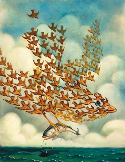
Figure 1.1.1. "Life is a danceable Tragedy", Pinterest
https://www.pinterest.com/pin/445363850660896849/?nic_v3=1a1mnf6qN
The definition of Contrast is the juxtaposition of strongly dissimilar elements. A design work that doesn't have enough contrast might look dull. Having a good contrast can boost visual interest.
Gestalt Theory
Figure 1.1.2. "Définition théorie de la Gestalt ou lois de la Gestalt", Pinterest
https://www.pinterest.com/pin/582301426828292257/?nic_v3=1a1mnf6qN
Figure 1.1.3. , Pinterest
https://www.pinterest.com/pin/556827941422723228/?nic_v3=1a1mnf6qN
Human brains tend to see in patterns, logic, and structure from all mixed elements. "Gestalt" means "shape" or "form" in German. It shows how human eyes perceive the shapes as a single, united form rather than the separate elements involved.
Similarity
https://www.pinterest.com/pin/9077636733616632/?nic_v3=1a1mnf6qN
Human eyes tend to take similar elements aligned together as a complete group of images.
Continuation
Figure 1.1.5. "Henry Domke Fine Art", Pinterest
https://www.pinterest.com/pin/914934480522141464/?nic_v3=1a1mnf6qN
Human eyes naturally follow paths, lines and curves of a design. Also, prefers to see a continuous flow of them.
Closure
Figure 1.1.6. "Gestalt Theory Animal Graphics", Pinterest
https://www.pinterest.com/pin/168744317278087782/?nic_v3=1a1mnf6qN
Human eyes prefer to see complete shapes. Even though a visual element is not fully complete, human brains automatically recognize it as a complete shape by filling in the missing visual information.
Proximity
Figure 1.1.7. "Design Principles - Proximity", Pinterest
https://www.pinterest.com/pin/65231894580555599/?nic_v3=1a1mnf6qN
Proximity is an alignment of related design elements placed together. Close proximity indicates that the items close to each other are related.
Figure / ground
Figure 1.1.8. ", Pinterest
https://www.pinterest.com/pin/678002918916091698/?nic_v3=1a1mnf6qN
Objects are instinctively perceived as being placed in the foreground or the background.
Symmetry & order
Figure 1.1.9. "
Kaleidoscope"
, Pinterest
https://www.pinterest.com/pin/306526318393580304/?nic_v3=1a1mnf6qN
Objects that are placed in symmetrical order with each other will be more likely to be perceived as grouped elements.
INSTRUCTIONS
Figure 1.2.1 Design Principles Task Instruction
Exercise 1 - Design Principles & Theory
For the first exercise, we had to select 5 design principles from the list below and create a design for each principle.
-
Gestalt theory
-
Contrast
-
Emphasis
-
Balance
-
Repetition
-
Movement
-
Harmony & Unity
-
Symbol
-
Word and Image
The design principles I've chosen are balance, movement, repetition, harmony & unity and emphasis.
Balance
Week 1 (30/08/2022)
reference
Figure 1.2.2 balance sketch reference
(image by Quilt Inspiration, Pinterest)
https://www.pinterest.com/pin/7459155614891085/
The design sketch for balance was created by taking the beautiful Hawaiian quilts by Japanese masters as the reference.
Figure 1.2.3 balance sketch
This design sketch visualizes my personal experience. It expresses my first impression of floral milk tea that I had for the first time in my life. Every element in this design is symmetrically balanced.
Figure1.2.4 balance sketch2
There are two flowers centred with their leaves around, and the floral milk tea is splashing at the back.
The red heart placed behind the flowers represents my love for floral milk tea.
Week 2 (06/09/2022)
FEEDBACK
Figure 1.2.5 the part of the balance sketch had feedback on
I had feedback on the change I made on the flower stems of the balance sketch. Mr.Jinci told me it is better to stick with the original sketch.
Figure 1.2.6 updated balance sketch
I redrew the stem of the flowers based on the feedback I received. Also, a few milk tea droplets were added for more decoration.
Week 4 (20/09/2022)
Figure 1.2.7 Final work for Balance
This design sketch visualizes my personal experience. It expresses my first impression of floral milk tea that I had for the first time in my life. Every element in this design is symmetrically balanced. There are two flowers centred with their leaves around, and the floral milk tea is splashing at the back. The red heart placed behind the flowers represents my love for floral milk tea.
Movement
Week 1 (30/08/2022)
reference
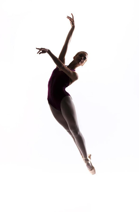
Figure 1.2.8 movement sketch reference
(Ballerina jump by Steve Williams, Pinterest)
https://www.pinterest.com/pin/353743745740567416/
This jumping ballerina image by Steve Williams was used for reference in the movement design sketch.
Figure 1.2.9 movement sketch
In this design work, a girl is about to have a cup noodle for her late-night snack. She's excited about it and starts dancing with the cup noodle.
Figure 1.3.1 movement sketch 2
The noodle patterns were applied to the background to emphasize movement. Some noddle flakes were added for more details.
Week 2 (06/09/2022)
Figure 1.3.2 the part of the movement sketch had feedback on
I had feedback on the girl's hair to make it blown off a bit more to express more movement.
Figure 1.3.3 updated movement sketch
Based on the feedback, her hair was drawn to be blown off a bit more.
Week 3 (13/09/2022)
Figure 1.3.4 updated movement sketch
The background became more settled, and shadow was added to the figure and the background. The flakes need more improvement in terms of details.
Week 4 (20/09/2022)
Figure 1.3.5 Final work for Movement
In this design work, a girl is about to have a cup noodle for her late-night snack. She's excited about it and starts dancing with the cup noodle. The noodle patterns were applied to the background to emphasize movement. Some noddle flakes were added for more details.
Repetition
Week 1 (30/08/2022)
reference
Figure 1.3.6 repetition sketch reference
https://www.pinterest.com/pin/945896727959972353/
Figure 1.3.7 repetition sketch 1
Many people are looking at their phones in a repetitive pattern. This design sketch reflects the atmosphere of the current society we're living in.

Figure 1.3.8 repetition sketch 2
This design sketch has white spaces surrounding the main artwork, but it's not noticeable on the white background. I chose orange for the colour of this work because orange usually indicates 'energy'.
People nowadays use their phones to reload their energy or to be comforted while they rest in their spare time; however; playing on their phones can take a lot of energy out of them.
FEEDBACK
Figure 1.3.9 the part of the repetition sketch had feedback on
I had feedback on my repetition sketch to readjust the distance between the characters regularly.
Figure 1.4.1 updated repetition sketch
Through week 3, a yellow stroke was added to clearly show the design's outline.
The gaps between characters were adjusted to be more even.
Week 4 (20/09/2022)
Figure 1.4.2 Final work for Repetition
Many people are looking at their phones in a repetitive pattern. This design sketch reflects the atmosphere of the current society we're living in. I chose orange for the colour of this work because orange usually indicates 'energy'. People nowadays use their phones to reload their energy or to be comforted while they rest in their spare time; however; playing on their phones can take a lot of energy out of them.
Emphasis
Week 1 (30/08/2022)
reference
Figure 1.4.3 emphasis sketch reference (Emphasis, Pinterest)
https://www.pinterest.com/pin/161988917834456512/
sketches
Figure 1.4.4 emphasis sketch 1
There is only one ear among the lips. Some people like to talk but not listen.
Figure 1.4.5 emphasis sketch 2
The colours of the lips and the background have similar tones to stress the ear in the middle. Blood on the ear is also placed to emphasize the meaning behind this work.
Week 3 (13/09/2022)
FEEDBACK
Figure 1.4.6 the part of the emphasis sketch had feedback on
I had feedback on the size of the ear in the design work. The colours of the lips and the background have similar tones to stress the ear in the middle. Blood on the ear is also placed to emphasize the meaning behind this work. The size of the ear to be increased a bit more to emphasize the ear even more.
Week 4 (20/09/2022)
Figure 1.4.7 Final work for Emphasis
There is only one ear among the lips. Some people like to talk but not listen. The colours of the lips and the background have similar tones to stress the ear in the middle. Blood on the ear is also placed to emphasize the meaning behind this work. The size of the ear has been increased based on the feedback. Also, the blood is dripping from the ear to the lips below to stress the message of this work.
Harmony and Unity
Week 1 (30/08/2022)
reference
Figure 1.4.8 harmony and unity reference
(Living in harmony with nature in love and unity..., Pinterest)
https://www.pinterest.com/pin/384072674480991834/
I referred to this illustration for the warm tone of the colour scheme.
sketches
Figure 1.4.9 harmony and unity sketch
We all have different interests, jobs and lives. Our lives become more colourful and various when we are together.
Week 3 (13/09/2022)
FEEDBACK

Figure 1.5.1 updated harmony and unity sketch
Colours were added to the figures and to the background. Details are in progress.
Week 4 (20/09/2022)
Figure 1.5.2 updated harmony and unity sketch
We all have different interests, jobs and lives. Our lives become more colourful and various when we are together.
REFLECTION
Experience
For 4 weeks, I learned the definition of various design principles, also how to use them and when to use them properly. It was so helpful and filled my knowledge. I‘ve always applied design principles such as emphasis, harmony and repetition, etc to my artworks when I draw for fun, but it was just based on my sense not because I learned its theories.
Observation
I observed that I really enjoy the process of coming up with a bunch of rough ideas, and also expressing them through artworks.
Findings
I realized that the pre-recorded lectures and the lecture slides were really effective for me to understand overall tasks and disciplines. Also, now that I know how and where to use each design principle, I’m looking forward to utilizing them for further projects.


.jpg)


Comments
Post a Comment