Typography / Task 3: Type Design & Communication
10/10/2022 - 07/11/2022 / Week 7 - Week 11
Kim Min Ah / 0356145
Typography / Creative Media / Taylor's Design School
EXERCISE
Task 3: Type Design & Communication
PHYSICAL CLASS
Week 7 (10/10/2022)
Public Holiday
Week 8 (17/10/2022)
Independent Learning Week
Week 9 (24/10/2022)
Public Holiday
Week 10 (31/10/2022)
Received feedback on digitalized letterforms.
Week 11 (07/11/2022)
Received feedback on the typeface before final submission.
Have informed about the final compilation project and the group project.
LECTURES
Typo Task 3A Typeface construction (Shapes)
1. Research
2. sketch (about 5 to 6)
3. find a proper reference (among the 10 typefaces)
4. Deconstruction - create a typeface
X-height should be 500pt X 500 pt
Use guides to identify the x-height, ascender, capital and descender lines.
Typo_Task 3A_illustrator To Fontlab5 Demo
Make sure to combine the letterforms by using shape-builder tools.
1. File - font info -metrics (key dimensions)
2. Double-click on each letter cell - bring y axis close to a letter - copy and paste
3. Metrics - Adjust kerning
4. Double-click on the space cell to create space
5. file - generate font - save
INSTRUCTION
Figure 1.1.1 Typography Task Instruction
Task 3: Type Design & Communication
Design a font based on resources from research and deconstruction of reference typeface.
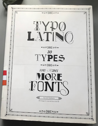
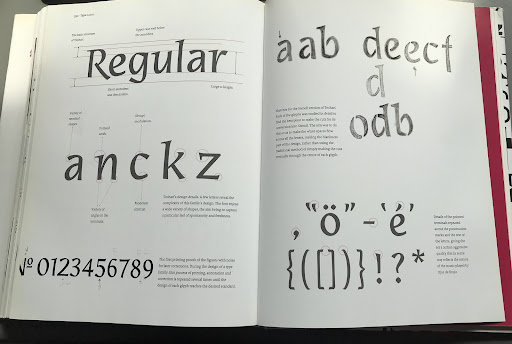
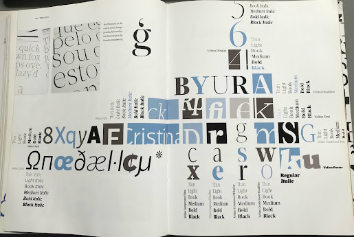
Figure 1.1.8 Page 102 - 115, "Lettering & Type" by Bruce Willen Nolen Strals (available at Taylor's Library)

Figure 1.1.9 GTAcademy lesson #9, Grilltype
https://www.instagram.com/p/CRjdPtSjz5K/?utm_medium=copy_link&fbclid=IwAR1kXqg5xIqGmgitCEkujYUhsrCnZ-gqBwH5WUT1MjQIDSiqJClU4DCLn-s

Figure 2.1.1 GTAcademy lesson #9, Grilltype
https://www.instagram.com/p/CRjdPtSjz5K/?utm_medium=copy_link&fbclid=IwAR1kXqg5xIqGmgitCEkujYUhsrCnZ-gqBwH5WUT1MjQIDSiqJClU4DCLn-s

Figure 1.2.1 Typeface Serifa letter g deconstruction

Figure 1.2.2 Typeface Serifa letter N deconstruction
Google drive link for font download
https://drive.google.com/file/d/1t_41zR8CXjrn3_CmjygdOXgZIQ1FrpZZ/view?usp=sharing
Final submission of poster

Figure 1.3.9 Final submission of the poster (JPG) (10/11/2022)
Figure 1.4.1 Final submission of the poster (PDF) (10/11/2022)
FEEDBACK
Week 10 (31/10/2022)
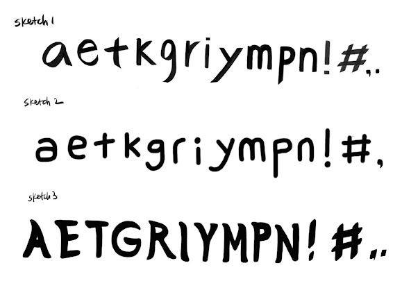
The hashtag has to be slanted.
Sketch 2 - Too much direction of the patterns on the letterform cause low readability.
Sketch 3 - Creating typefaces rooted in handwritten forms is a good approach as it’s how typefaces were designed in old times.
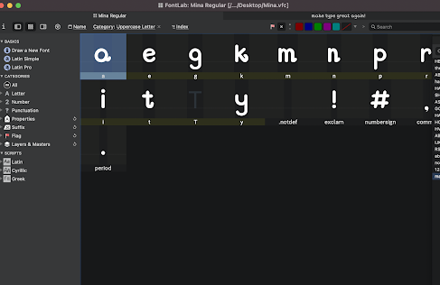
The letter "k" is not bad but the whimsical of it is too long enough to mess up with spacing with other letters. The letter "g" and "y" don't work. Punctuation marks don't work either.
Use the "shear tool" in adobe illustrator to give a slanting.
Week 11 (07/11/2022)
Same issues as last time, long whimsical would create wide gaps between letters.
Still have Issues with the punctuation marks.
REFLECTION
Experience
Working on task 3 was quite interesting to me. I learned how to create typefaces by using illustrator and Fontlab. This task has been an eye-opening experience for me. I used to not have a great interest in typography. To me, typography has always seemed like a subject that requires rules and techniques than creativities. However, this thought changed after experiencing typeface design through this task.
Observation
After researching and reading some books, I’ve had a fundamental understanding of type design. Nevertheless, I observed that it was never sufficient to create an acceptable typeface. Especially the punctuation marks were the most challenging part for me.
Findings
I found that researching and reading books about typography has enriched my knowledge and helped me through the whole progress of this task.
A decent typeface must contain high legibility and good design at the same time. However, according to what Mr. Vinod and Mr. Scheichelbauer (Go go glyphs) have mentioned, creating a proper typeface is not something that can be completed in one day, it consumes several weeks, months, or sometimes even years. Thus, I realized that good typefaces require fine design structures, and fine design structures can be formed only by a large amount of study and consistent effort.
FURTHER READING
Week 7 (page 12) Comparing typeface
Every letterform includes image, history and meaning in typography.
The ten typefaces were designed to provide easy readability and appropriate expression of contemporary esthetics. These typefaces have surpassed the letter goal.
Week 8 (page 13)
Similarities among typefaces are worth nothing, but their different accumulated choices render each typeface unique. Some typefaces have more whimsical, and some are more mechanical.
All typefaces with different glyph features allow users to choose appropriate typefaces for each usage.
Week 9 (page 14)
Font sizes for primary presentation are from 6pt to 12pt. Types presented at 18pt and beyond are considered for headlines or call-outs, referred to as display type.
Display Typefaces are meant to be “seen” more than “read”.
Week 10 (page 16-17)
Alphabets are a series of culturally agreed-upon marks.
The word “alphabet” is a compression of The first two letters of the Greek alphabet: alpha and beta.
Greeks adopted the 20 letters from the Phoenician alphabet and changed the shape and sound of some letters. (The Phoenician alphabet is also the forerunner of modern Hebrew and Arabic.)
Week 11 (page 18)

Figure 1.4.7 screenshot of page 18, Measuring Type, A type primer by John

The compressed version of square capitals(rustic capitals) allowed twice as many words on a sheet.
The pen or the brush was held at an angle of 30 degrees off the perpendicular. These letterforms are faster and easier to write down, however, due to their compressed nature, it has low readability compared to square capitals.
Both square capitals and compressed capitals can be found. Usually used for daily use and written with cursive hand.






.png)
2.png)


Comments
Post a Comment