Design Principles / Final Project : Visual Analysis
01/11/2022 - 29/11/2022 / Week 10 - Week 14
Kim Min Ah / 0356145
Design Principles / Creative Media / Taylor's Design School
CLASS
Week 11 (08/11/2022)
Received feedback on visual analysis from Ms. Jin Chi.
Week 12 (15/11/2022)
Received feedback on visual analysis(interpretation & idea sketch) from Ms. Jin Chi.
Week 13 (21/11/2022)
Received feedback on the idea sketch from Ms. Jin Chi.
Week 14 (29/11/2022)
Received feedback on the final result from Ms. Jin Chi.
LECTURE
Pre-recorded Lecture (Visual Analysis)
Visual Analysis is a method of understanding design works including descriptions and explanations.
Practicing visual analysis can help us understand artists’ intentions in their works.
To work on visual analysis.
We have to go through the following phases: Observation, Analysis and Interpretation.
“Observation” is for looking and thinking about how the overall design has been placed.
“Analysis” is to consider how each design element has affected viewers based on what we’ve observed.
“Interpretation” is composed of observations and analysis with facts about design works.
INSTRUCTIONS
Figure 1.1.1 Design Principles Task Instruction
Final Project - Visual Analysis

Figure 1.1.2 illustration by Erin Aniker, We Heart Exhibition
Rationale
I chose this design work because the entire design is evident to show the major message: confronting "inequalities". It's not only reflecting the problem in our society with the direct phrase but is also showing the diversity of individuals visually which allows more audiences can relate and react to the work.Observation
Analysis
Interpretation
FEEDBACK WEEK11
Explain further on emphasis, movement(the alignment of letters & little strokes around them) and balance(tattoos and hennas).
Sketch

Figure 1.1.3 Idea sketch
This drawing presents a continuous reaction to the illustration by Erin Aniker. One of the messages that stand out the most in her artwork was "support" and "togetherness". Thus, I decided to focus on expressing support and encouragement. The girls are putting wings on each others' backs to be ready to fly in freedom together.

Figure 1.1.3 Idea sketch
FEEDBACK WEEK12
Show more diversity in girls' appearances. Present more "strength". (e.g. girls already flying in the sky)
Research more images of support.
Updated sketch

Figure 1.1.4 Updated idea sketch
Based on the feedback I received in week 12, I created another sketch that shows more sense of "strength". The previous sketch only shows the moment of preparation before the girls fly. However, this updated sketch expresses the ongoing flying in freedom moment of the girls. Each figure of the girls holding each others' hands is arranged to form a huge wing altogether, which connotes not only individuals having rights of freedom but also supporting each other and being aware of the sense of "togetherness". The phrase placed in the middle, "fly in freedom together" gives an additional clearer direction to viewers.

Figure 1.1.4 Updated idea sketch

Figure 1.1.5 Updated sketch

Figure 1.1.6 Updated sketch
FEEDBACK WEEK13
Try a different shape of wings. For consistency, it would be better to use a handwriting style font for the phrase in the middle.
Reference

Updated sketch

Figure 1.1.8 Updated sketch 1

Figure 1.1.9 Updated sketch 2
FEEDBACK WEEK14
Sketch 1 works better to imply the entire concept of the illustration.
The wings look like "crosses", need some improvement on them.

Figure 1.1.8 Updated sketch 1
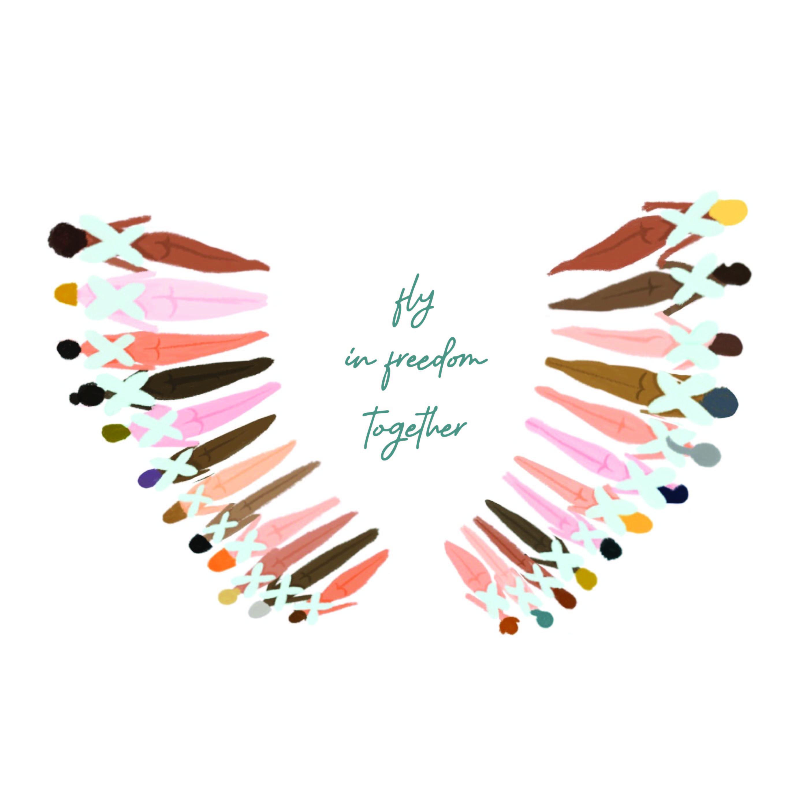
Figure 1.1.9 Updated sketch 2
FEEDBACK WEEK14
Sketch 1 works better to imply the entire concept of the illustration.
The wings look like "crosses", need some improvement on them.
Final submission

Figure 1.2.1 Submission of the final project

Figure 1.2.1 Submission of the final project


Comments
Post a Comment