Advanced Typography / Task 2 / 2(A): Key Artwork + 2(B): Collateral
03/05/2022 - 31/05/2022 / Week 5 - Week 9
Kim Min Ah / 0356145
Typography / Creative Media / Taylor's Design School
TASKS
Task 2 / 2(A): Key Artwork
Task 2 / 2(B): Collateral
LECTURES
AdTypo_5 Perception and Organization
Colour
It’s crucial to know how to use colours well.
The wrong choice or excessive use of colours can cause confusion.
Form
Form is important in that it creates good visuals and readability.
A good form gives a balanced harmony.
Also, it provides visual interaction.
INSTRUCTIONS
Task 2 / 2(A): Key Artwork
Research
https://www.pentagram.com/work
Pentagram
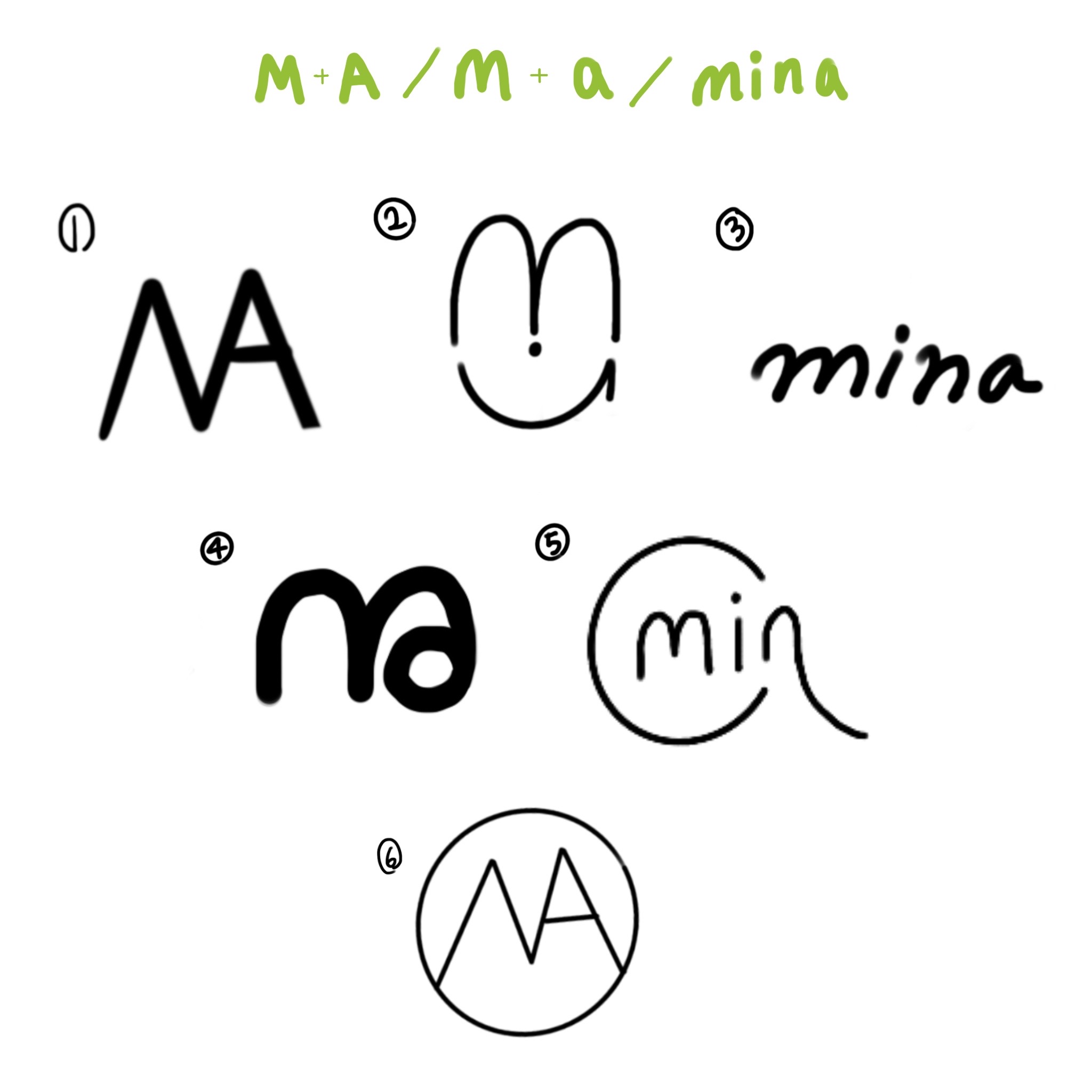
Fig 1.1.2 rough sketches (01/05/2023)
Keywords:
Simple and round
Sketch #1: Combining the uppercase letters "M" and "A" into a single, unified shape.
Sketch #2: Depicting a cheerful face using various letterforms. The lowercase "m" forms the eyes, the dot of the letter "i" serves as the nose, and half of the letter "a" represents the lips.
Sketch #3: Presenting the word "mina" written in elegant, rounded handwriting.
Sketch #4: Merging the lowercase letters "m" and "a" together with smooth curves and rounded edges.
Sketch #5: Designing the letters "min" in rounded forms enclosed within a circle. The circle intersects with the tail of the letter "n," forming a lowercase "a."
Sketch #6: Expanding upon the initial concept of Sketch #1, emphasizing the idea of roundness by incorporating a circle.
Digitalization

Fig 1.1.3 digitalization (02/05/2023)
Embracing and moving forward.

Fig 1.1.4 further exploration 1 (09/05/2023)

Fig 1.1.5 further exploration 2 (09/05/2023)

Fig 1.1.6 further exploration 3 (12/05/2023)

Fig 1.1.7 Construction (12/05/2023)
Through the key artwork, I wanted to imply the goals I'd like to reach as a graphic designer; to be able to embrace challenges and lead positive trends. The use of round shapes in the letterforms creates an atmosphere of "embracing." Moreover, by combining the lowercase "m" and the tittle of the lowercase "i," the artwork forms a human figure that symbolizes embracing. The dot represents the head, while the lowercase "m" represents the embracing arms.
Final Submission
Embracing and leading

Fig 1.1.8 Final key artwork JPG (12/05/2023)
Fig 1.1.9 Final key artwork PDF (12/05/2023)
Faun | packaging design, Behance
https://www.behance.net/gallery/102122979/faun-packaging-design?tracking_source=for_you_feed_activity

Fig 1.2.1 Key artwork colour palette (17/05/2023)
The key artwork and the colour palettes give an impression of a sports brand.

Fig 1.2.2 Key artwork animation idea sketch (18/05/2023)
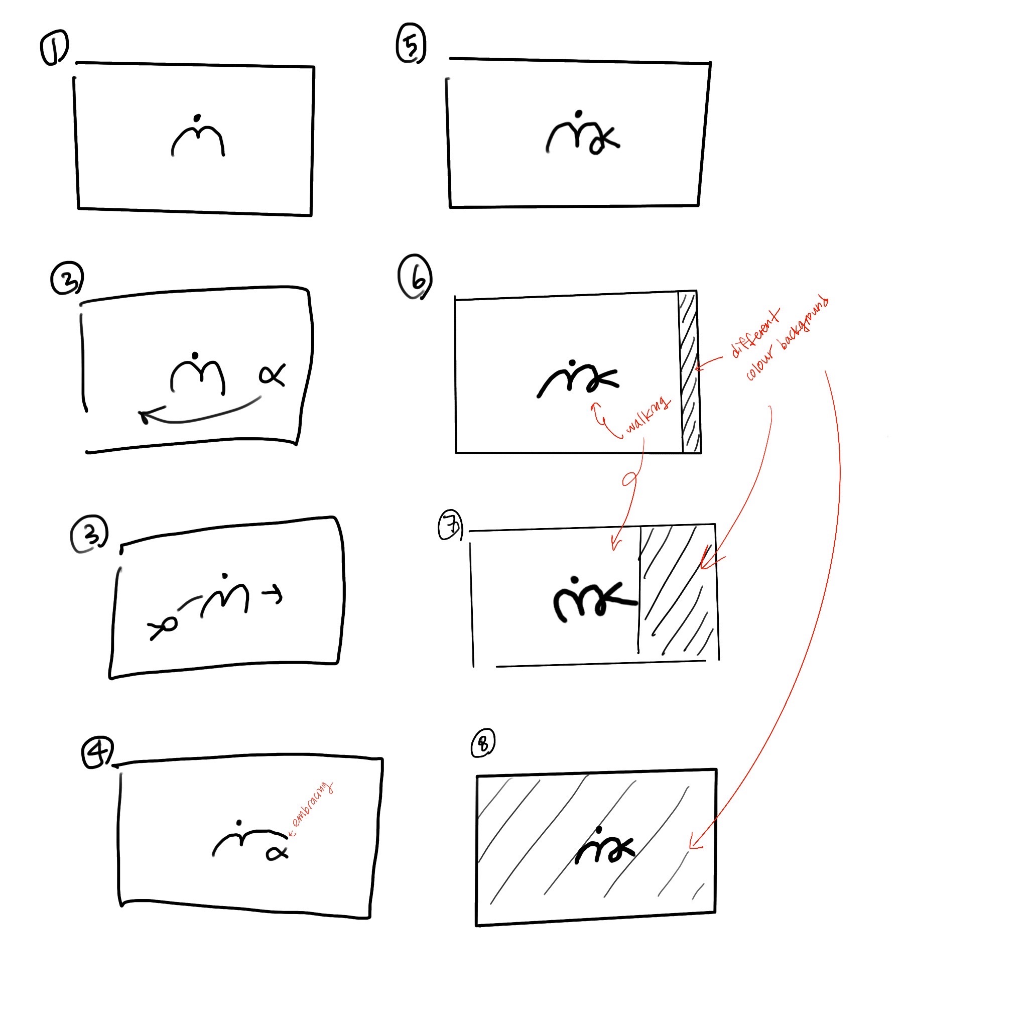
Fig 1.2.3 Key artwork animation idea sketch (18/05/2023)
- First attempt

Fig 1.2.4 Letterhead (20/05/2023)

Fig 1.2.5 Business card (20/05/2023)


Fig 1.2.7 Minak cap mockup (21/05/2023)
I tried to play with the logo placement on the background, intending the logo to look like a human figure wearing the cap.

Fig 1.2.8 Minak Instagram page (24/05/2023)

Fig 1.2.9 Minak Instagram page (30/05/2023)

Fig 1.3.1 Minak Instagram tile arrangement art (30/05/2023)

Fig 1.3.2 Minak Instagram tile arrangement (30/05/2023)
Stationery
Shirt
https://mrmockup.com/download-in-progress/?dlm-dp-dl=9203
Socks
https://www.psfreebies.com/free-socks-mockup-psd/
Phone case
https://www.mockupworld.co/free/iphone-case-mockups/
Mug
Sports bra
Key Artwork (JPG)

Fig 1.3.3 Final key artwork (12/05/2023)

Fig 1.3.4 Final key artwork with colour (12/05/2023)

Fig 1.3.5 Final key artwork with primary colours (12/05/2023)

Fig 1.3.6 Final key artwork with primary colours (12/05/2023)
Fig 1.3.7 Final key artwork (12/05/2023)
.gif)
Fig 1.3.8 Final Minak animation, GIF (30/05/2023)

Fig 1.3.9 Final Minak stationery, JPG (30/05/2023)

Fig 1.4.1 Final Minak notebook, JPG (30/05/2023)

Fig 1.4.2 Final Minak mug, JPG (30/05/2023)

Fig 1.4.3 Final Minak phone case, JPG (30/05/2023)


Fig 1.4.7 Final Minak collaterals, PDF (30/05/2023)

Fig 1.4.8 Screenshot of final Instagram (30/05/2023)
FEEDBACK
Week 5 (03/05/2023)
KEY ARTWORK
1. Does the key artwork symbolically/creatively represent the person?
2. Is the key artwork readable and legible?
3. Does the key artwork look well crafted (lines/shapes)?
4. Does the key artwork look like a logo—is it free-standing (w/background)?
5. Is there a good balance between negative and positive space?
6. Is there unnecessary use of non-objective elements?
My sketches passed most of the questions except question #2, "Is the key artwork readable and legible?", which is the most essential part of a logo.
Feedback I received from my peers:
Sketch #1: It doesn't really attract much attention. Reminds of the "MAMA" noodle logo.
Sketch #2: It doesn't really attract much attention. Not unique enough.
Sketch #3: It looks like a logo and represents my image the most, but has low legibility.
Sketch #4: Have better legibility compared to other ones.
Sketch #5: Interesting.
Sketch #6: Interesting. Have better legibility compared to other ones.
Feedback from Mr.Vinod:
Sketch #4 and Sketch #6 have interesting forms.
The keywords also have to be objective.
At least three letters have to be included.
Week 6 (10/05/2023)
The form needs to be constructed better.
The letterform looks like a handwriting script.
Need more exploration (e.g. including "K").
Week 7 (17/05/2023)
We mostly focused on working on task 2 and class activities. Logos can’t have pastel-toned colour. Logos have to have strong colours to be recognizable and memorable. Collateral design: Express whatever the key artwork represents. The designs have to be simple but precise at the same time.
Week 8 (24/05/2023)
Good use of colour, but can be better with more exploration. It's slightly repetitive.
Week 9 (31/05/2023)
General feedback:
-Write a bio that reflects the brand
-Repetitive use of a logo reduces the power of the logo itself.
Feedback on ideation:
1.
-Icons might confuse users.
2.
-Individual letterforms can have a line on the top of them.
-Create extra brackets to complete the stamp.
3.
-Uppercases could be in secret code forms, and lowercase could be in regular letterforms.
REFLECTION
Experience
Task 2(A): key artwork was interesting and enjoyable. To create key artwork, we had to utilize at least three letters of our name to express the wey words. In my case, I used "m", "i", "n", and "a" from my first name and "k" from my last name to express "embracing" and "moving forward." Then, we were required to expand on the completed key artwork to create collateral designs for task 2(B).
Observation
I observed that expressing the keywords utilizing letters is quite challenging. It had to be aesthetic and readable at the same time. The outcome had to be enough to show the keywords as well. It had me do more research and exploration compared to other tasks. Also, coming up with several designs by expanding on the design of key artwork requires quite a bit of research and exploration.
In addition, I learned that using a colour palette that creates harmony and contrast is very necessary. Selecting proper colours that can represent the characteristics of the design is also crucial.
Findings
I found that working on both tasks was a good experience overall.
I enjoyed all progress since I was to create something that reflects myself. Moreover, all the exercises were very beneficial since I could glimpse how the progress of branding works.
FURTHER READING

Fig 1.4.9 The Vignelli Canon by Massimo Vignelli (03/05/2023)
Week 5 (pages 18 - 19)
Appropriateness
Week 6 (pages 20 - 21)
Ambiguity
Week 7 (pages 22 - 23)
Design Is One


Comments
Post a Comment