Advanced Typography / Task 3: Type Exploration and Application
24/05/2022 - 05/07/2022 / Week 8 - Week 14
Kim Min Ah / 0356145
Typography / Creative Media / Taylor's Design School
TASKS
Task 3: Type Exploration and Application
INSTRUCTIONS
Task 3: Type Exploration and Application
Fig 1.1.2 Task 3 Ideation(31/05/2023)
Harmony Of Characteristics of Korean and Roman Letterforms

Fig 1.1.3 Task 3 mindmap (05/06/2023)

Fig 1.1.4 Task 3 references (05/06/2023)

Fig 1.1.5 Task 3 references (06/06/2023)
Reference Lists:
Flowers (Set with spring flowers...., Pinterest)
https://www.pinterest.com/pin/936678422473172702/
Korean hibiscus illustration (Flowers In Clusters White..., Pinterest
https://www.pinterest.com/pin/56365432827345301/
Korean patterns in red colours (Untitled, Pinterest)
https://www.pinterest.com/pin/844493671058449/
Letter "M" with floral illustrations (Floral letters, Pinterest)
https://www.pinterest.com/pin/156992737004191774/
t115B r1 박태수 02 체계적 한글 서예 교본 한양근 씀(도서출판우람), Pinterest
https://www.pinterest.com/pin/70439181665494429/
Decorative typeface (Moalang: A free decorative..., Pinterest)
https://www.pinterest.com/pin/598978819208896017/
Floral font (De Flore – Free Floral Font, Pinterest)
https://www.pinterest.com/pin/322570392055590112/

Fig 1.1.6 Task 3 references (06/06/2023)


Fig 1.1.8 Task 3 initial elements of lowercases (13/06/2023)

Fig 1.1.9 Task 3 progress (13/06/2023)

Fig 1.2.1 Task 3 progress (15/06/2023)

Fig 1.2.2 Task 3 progress (16/06/2023)

Fig 1.2.3 Task 3 progress (16/06/2023)

Fig 1.2.4 Task 3 progress (19/06/2023)


Fig 1.2.6 Task 3 2nd attempt uppercase progress (21/06/2023)

Fig 1.2.7 Task 3 2nd attempt fundamental shapes (21/06/2023)

Fig 1.2.8 Task 3 2nd attempt uppercase progress (21/06/2023)

Fig 1.2.9 Task 3 2nd attempt uppercase progress (21/06/2023)

Fig 1.3.1 Task 3 2nd attempt lowercase progress (22/06/2023)


Fig 1.3.3 Task 3 2nd attempt lowercase progress (27/06/2023)

Fig 1.3.4 Task 3 2nd attempt punctuation mark progress (27/06/2023)

Fig 1.3.5 Task 3 2nd attempt progress (30/06/2023)

Fig 1.3.6 Task 3 2nd attempt progress (30/06/2023)

Fig 1.3.8 Task 3 final letterforms (30/06/2023)

Fig 1.3.9 Task 3 2nd attempt kerning progress (30/06/2023)

Fig 1.4.1 Task 3 2nd attempt kerning progress (30/06/2023)

Fig 1.4.2 Task 3 2nd attempt kerning progress (30/06/2023)

Fig 1.4.3 Task 3 Final letterforms, ROKO (05/07/2023)

Fig 1.4.4 Task 3 presentation colour palette (05/07/2023)

Fig 1.4.5 Task 3 presentation progress (05/07/2023)

Fig 1.4.6 Task 3 presentation progress (06/07/2023)

Fig 1.4.7 Task 3 presentation progress (07/07/2023)
The presentation was intended to be designed to give a neat impression with high contrast of colours.
Sketch

Fig 1.4.8 Task 3 application progress (03/07/2023)

Fig 1.4.9 Task 3 application progress (03/07/2023)

Fig 1.5.1 Task 3 application progress (04/07/2023)
Gyeongbokgung
https://www.pinterest.com/pin/918030705270908682/
Bukchon
https://www.pinterest.com/pin/721350065338195682/
Namsan
https://www.pinterest.com/pin/728527677235183125/
Everland
https://www.pinterest.com/pin/52213676909291706/
Chunggyecheon
https://www.pinterest.com/pin/373306256613582747/
Dongdaemun market
https://www.pinterest.com/pin/131097039129223344/
Seokchon Lake
https://www.pinterest.com/pin/665899494925947658/
Myeongdong Cathedral
https://www.pinterest.com/pin/820218150911135808/
Kimchi Stew
https://www.pinterest.com/pin/187884615696854665/
Naengmyeon
https://www.pinterest.com/pin/510666045260702062/
Tteokbokki
https://www.pinterest.com/pin/79376012175920121/
Patbingsu
https://www.pinterest.com/pin/94223817179147184/
Jjajangmyeon
https://www.pinterest.com/pin/263671753177115170/
Sikhye
https://www.pinterest.com/pin/3096293486783869/
Seoul Park
Application (2nd attempt)

Fig 1.5.2 Task 3 application progress (07/07/2023)

Fig 1.5.3 Task 3 application, notebook cover progress (07/07/2023)
Final Submission

Fig 1.5.4 Task 3 final presentation slide page 1 (07/07/2023)

Fig 1.5.5 Task 3 final presentation slide page 2 (07/07/2023)

Fig 1.5.6 Task 3 final presentation slide page 3 (07/07/2023)

Fig 1.5.7 Task 3 final presentation slide page 4 (07/07/2023)

Fig 1.5.8 Task 3 final presentation slide page 5 (07/07/2023)


Fig 1.6.1 Task 3 final presentation slide page 7 (07/07/2023)
Fig 1.6.2 Task 3 final presentation slide (07/07/2023)

Fig 1.6.3 Task 3 final application poster 1 (07/07/2023)

Fig 1.6.4 Task 3 final application poster 2 (07/07/2023)

Fig 1.6.5 Task 3 final application notebook cover (07/07/2023)

Fig 1.6.6 Task 3 final application bag (07/07/2023)

Fig 1.6.7 Task 3 final application shirt (07/07/2023)
Application (PDF)
Fig 1.6.8 Task 3 final application (07/07/2023)
Mockup (JPG)

Fig 1.6.9 Task 3 final application poster 1 mockup (07/07/2023)
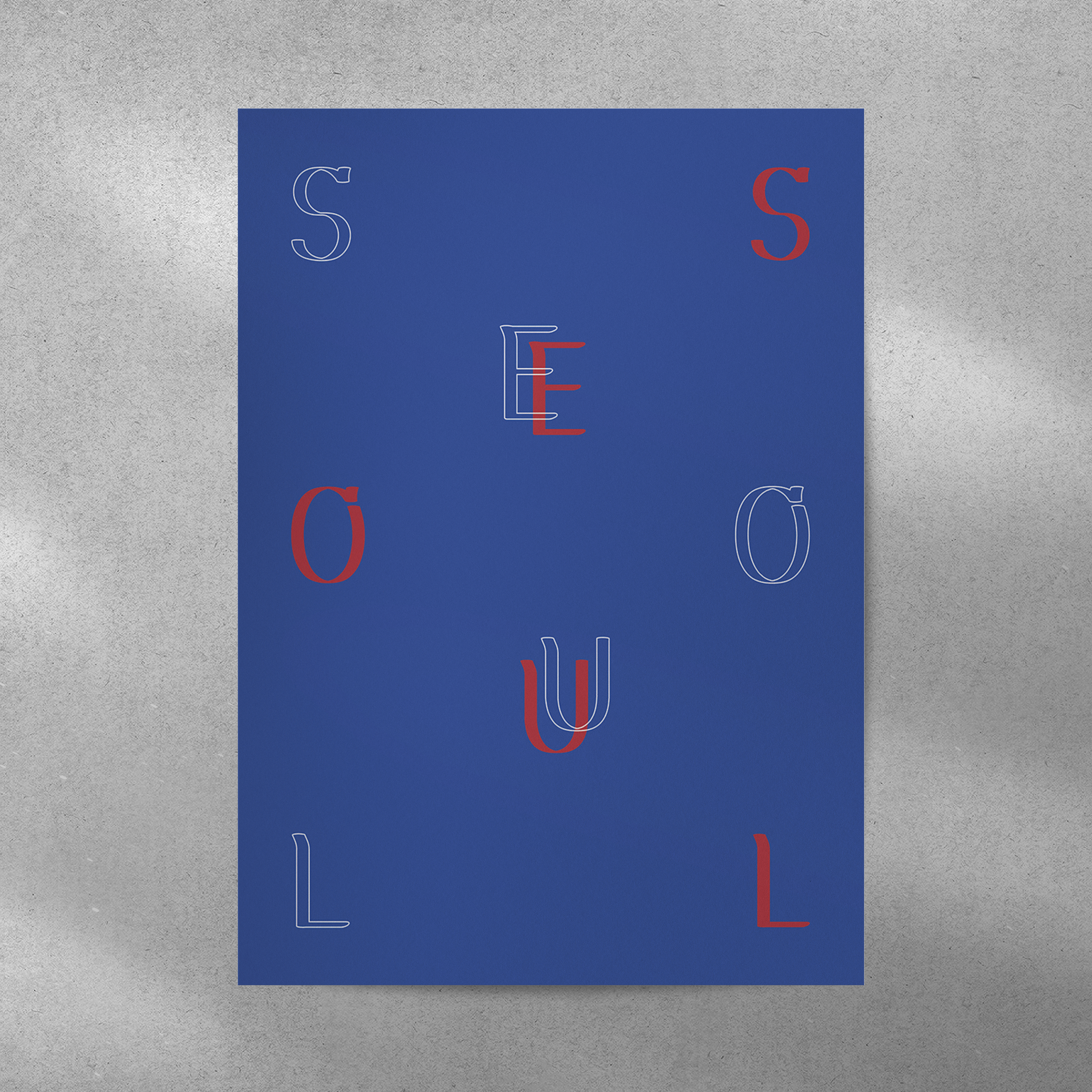
Fig 1.7.1 Task 3 final application poster 2 mockup (07/07/2023)

Fig 1.7.2 Task 3 final application notebook cover mockup (07/07/2023)

Fig 1.7.3 Task 3 final application bag mockup (07/07/2023)

Fig 1.7.4 Task 3 final application shirt mockup (07/07/2023)
Mockup (PDF)
Fig 1.7.5 Task 3 final application mockups (07/07/2023)
Mockup Resources
FEEDBACK
Week 10 (07/06/2023)
General feedback:
-1000px artwork to create a typeface
-Knowing how to present your work is very essential.
-Work on the upper case first and then the lower case.
Specific feedback:
-Keep the same width for every letterform (Monospace)
-The letterform has to be bold and consistent and sans-serif.
-Or the current letterform has to be thicker.
Week 11 (14/06/2023)

Fig 1.7.6 Week 11 feedback (14/06/2023)
-The letter J is too long
Consistency
- C & O
- P & R
- I
- J
-Keep the same thickness, proportion and direction of the letterforms.
-Keep the same characteristic on all letterforms.
-Do not be afraid of changing the idea, if the original idea is not working well.
Week 12 (21/06/2023)
- The circular shape makes the entire letterforms look unbalanced and unorganized.
- The letterforms are not visually appealing.

- Lowercases are too mall. Lowercases have to be the 2/3 size of the uppercase letter "B" like the image above.

Fig 1.7.8 Week 12 feedback (21/06/2023)
- When designing the uppercase letter “M”, reference an existing letterform since the thickness of each stem is not equivalent. The same goes for “X”, “Y”, etc.
REFLECTION
Experience
Working on Task 3 was a simultaneously enjoyable, beneficial, and challenging experience. The final project required creating a complete set of typefaces along with applications and a presentation. The idea of creating my own typeface was exciting. However, designing a typeface from scratch was tough. Throughout the entire process, I constantly questioned whether I was on the right track. There were some moments when I had to make decisions. For example, I had to make adjustments to my ideas as I progressed, and I even had to start over with both the uppercase and lowercase characters since my initial outcome appeared disorganized and lacked visual appeal. Furthermore, a significant amount of time was spent crafting my first application (a brochure), and I realized that it did not meet the criteria for the task. As a result, I had to completely redesign the application as well. Task 3 challenged my time-management skills and critical thinking skills.
Observation
I noticed that creating a typeface demands a lot of knowledge and time. The most challenging aspect for me was maintaining consistency across all letters and punctuation marks. Additionally, kerning consumed more time during the process than I had anticipated. As I worked on the presentation for my typeface, I also discovered that a typeface has the potential to express its identity beyond visual appeal. It almost felt like a typeface has its own distinctive personality and ambiance.
Findings
As I mentioned above, kerning was one of the most challenging parts of creating a typeface. I found it difficult to determine the ideal spacing between letters. Furthermore, I noticed that the issue of kerning has continued not only in this specific task but also throughout all my typography projects since my first term in design school. Consequently, I believe that I require continuous study and practice in kerning.
FURTHER READING

Fig 1.7.9 The Vignelli Canon by Massimo Vignelli (07/06/2023)
Week 10 (pages 26 - 27 )
Intellectual Elegance
Intellectual elegance means a noble level of intelligence that can be found in all kinds of masterpieces in the history of mankind (e.g. Greek statues). Intellectual elegance helps us to find the best solution for everything. Intellectual elegance also reflects civic consciousness, social responsibility, decency and a way of conceiving design.
Week 11 (pages 28 - 29 )
Timelessness
The designer has to commit to designs that are timeless and transcends subjectivity.
The use of primary shapes and colours is always popular because their formal value is timeless.
Do not seek only visual titillation.
Week 12 (pages 30 - 31 )
Responsibility
Responsibility in design includes a form of economic awareness beyond a lavish manner to satisfy the designers or clients. Responsibility in design may be overlooked, but it is an important form of discipline. There are three levels of responsibility to designers, clients and the public.
Week 13 (pages 32 - 33 )
Equity
Recreating an existing logo with a desire for change could not be a good way to go.
When a logo is exposed to the public for a long period of time, it will be seared in people's memory and the logo itself becomes an equity.
Week 14 (pages 36 - 37 )
Paper Sizes
Two basic paper size systems:
International and American
The choice of paper size is important.
It involves with economy and production process. Also, the size of the paper itself carries a message in some cases.


Comments
Post a Comment