Typography / Final Compilation
29/08/2022 - 28/11/2022 / Week 1 - Week 14
Kim Min Ah / 0356145
Typography / Creative Media / Taylor's Design School
TASK
Typography / Task 1: Exercises - Type Expression
Typography / Task 2: Typographic Exploration & Communication
Typography / Task 3: Type Design & Communication
Typography / Special Task: Type Design & Communication (Ang Pow)
PHYSICAL CLASS
Week 1 (29/08/2022)
For the week 1 class, we had a brief introduction to typography class. We also learned how to set up an e-portfolio platform which is "blogger".
Week 2 (05/09/2022)
The class of week 2 started off with receiving feedback on our design sketches for the first exercise from Mr.Vinod. After that, we were taught how to create outlines, ungroup and distort each letter on adobe illustrator which is the required skill for the upcoming task.
Week 4 (19/09/2022)
In physical class on week 5, we had feedback on our Type formatting exercise and were informed about the upcoming task.
Week 6 (03/10/2022)
During the class, Students got to have chances to give each other feedback on Task 2 progress. Also, we had feedback on our work progress and e-portfolio from Mr.Vinod.
Week 7 (10/10/2022)
Public Holiday
Week 8 (17/10/2022)
Independent Learning Week
Week 9 (24/10/2022)
Public Holiday
Week 10 (31/10/2022)
Received feedback on digitalized letterforms.
Week 11 (07/11/2022)
Received feedback on the typeface before final submission.
Have informed about the final compilation project and the group project.
Week 12 (14/11/2022)
Worked on the Ang Pow project in a group.
Received feedback on our progress from Mr.Vinod.
Week 13 (21/11/2022)
Class cancelled
Week 14 (28/11/2022)
Public Holiday / Received feedback on final compilation reflection:
Task 1: Exercise 1 - Type Expression

Figure 1.1.1 final submission of type expression, exercise 1 (JPG) (05/09/2022)
Figure 1.1.2 final submission of type expression, exercise 1 (PDF) (05/09/2022)

Figure 1.1.1 final submission of type expression, exercise 1 (JPG) (05/09/2022)
Figure 1.1.2 final submission of type expression, exercise 1 (PDF) (05/09/2022)
Task 1: Exercise 2 - Type Expression
Animation, "Sticky"

Figure 1.1.3 frames of final submission of type expression, exercise 2 (19/09/2022)

Figure 1.1.3 frames of final submission of type expression, exercise 2 (19/09/2022)
Figure 1.1.4 final submission of type expression, exercise 2 (19/09/2022)
Figure 1.1.4 final submission of type expression, exercise 2 (19/09/2022)
Task 1: Exercise 3 - Type Formatting

Figure 1.1.5 final submission without baseline grids (JPG) (26/09/2022)

Figure 1.1.5 final submission without baseline grids (JPG) (26/09/2022)
Figure 1.1.6 final submission without baseline grids (PDF) (26/09/2022)
Figure 1.1.6 final submission without baseline grids (PDF) (26/09/2022)
Task 2: Typographic Exploration & Communication

Figure 1.1.7 Final submission of Typographic Exploration without grid (JPG) (09/10/2022)

Figure 1.1.7 Final submission of Typographic Exploration without grid (JPG) (09/10/2022)
Figure 1.1.8 Final submission of Typographic Exploration without grid (PDF) (09/10/2022)
Task 3: Type Design & Communication
Typeface, "Mina"
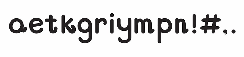
Figure 1.1.9 Final submission of Typeface, "Mina" (JPG) (07/11/2022)
Figure 1.2.1 Final submission of Typeface, "Mina" (PDF) (07/11/2022)
Google drive link for font download
https://drive.google.com/file/d/1t_41zR8CXjrn3_CmjygdOXgZIQ1FrpZZ/view?usp=sharing

Figure 1.1.9 Final submission of Typeface, "Mina" (JPG) (07/11/2022)
Google drive link for font download
https://drive.google.com/file/d/1t_41zR8CXjrn3_CmjygdOXgZIQ1FrpZZ/view?usp=sharing
Poster of Typeface, "Mina"

Figure 1.2.2 Final submission of the poster (JPG) (10/11/2022)
Figure 1.2.3 Final submission of the poster (PDF) (10/11/2022)

Figure 1.2.2 Final submission of the poster (JPG) (10/11/2022)
Figure 1.2.3 Final submission of the poster (PDF) (10/11/2022)
%20template.jpg)
Figure 1.2.4 Final submission of Ang Pow by Jaycee & Minah (with diecut, JPG) (21/11/2022)
%20Without%20the%20diecut.jpg)
Figure 1.2.5 Final submission of Ang Pow by Jaycee & Minah (without diecut, JPG) (21/11/2022)
Figure 1.2.6 Final submission of Ang Pow by Jaycee & Minah (PDF) (21/11/2022)
REFLECTION


Comments
Post a Comment